Left is Right
Creative technology
Digital art and software development
< Spin me

In 2026 I'm exhibiting and selling merchandise of my illustrations at festivals and events like Brighton Open Houses.
You can buy a selection of organic t-shirts, tote bags, prints, stickers and more here.
🛒 Buy t-shirts, bags & more ✉️ Sign-up for emails ℹ️ Instagram

Monopoly Lifesized is a live interactive game based in central London and due to go on tour in the USA. Working with Clockwork Dog I developed a chess game for the board property, 'St James Place'. In up to three separate rounds you're challenged to checkmate the AI opponent in two moves.
The Monopoly Lifesized chess game was made in React and works in conjunction with COGS show control system
The Paddington Bear Experience is an immersive live event that will take you into Paddington’s world, at County Hall on London's South Bank. Working with Clockwork Dog I developed 4 large real-time information screens, that mimic those found in a train station, whilst supporting the narrative of the show itself.
The screens were made in React and work in conjunction with COGS show control system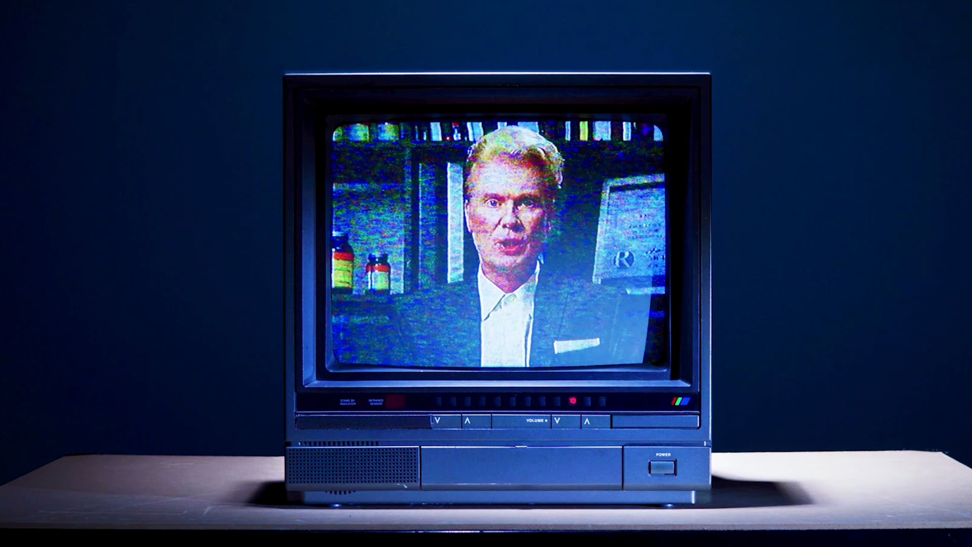
Corponation: The Sorting Process, is a dystopian sci-fi narrative game created by Brighton indie studio Canteen. I created and animated the boss character who was brought to life in the brilliant trailer. Corponation launched on Steam, Xbox and Nintendo Switch in 2024 and was published by Playtonic.
My work on Corponation started in a sketchbook, moved to Blender and was finished off in Unity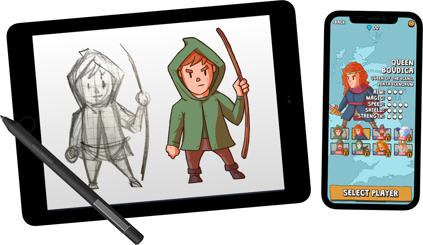
QuestBall is a fantasy tennis mobile game that I designed, built and marketed. In its first few weeks it had over 30,000 downloads, was awarded game of the week by TouchArcade.com and was featured in the App Store's 'New Games we love' section.
QuestBall was hand-drawn in a sketchbook and in ProCreate on an iPad, then built in Unity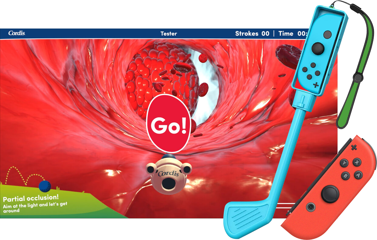
Golf It! was a motion-controlled game experience designed for the healthcare company Cordis. Inspired by Wii Sports Golf, you hit a capsule around the inside of human arteries, past golf-like obstacles, trying to finish fast and on par. Golf it! was playable in person at live events using Nintendo Switch joy-cons in a golf grip controller.
Golf It! was created in Sketch, Blender and Unity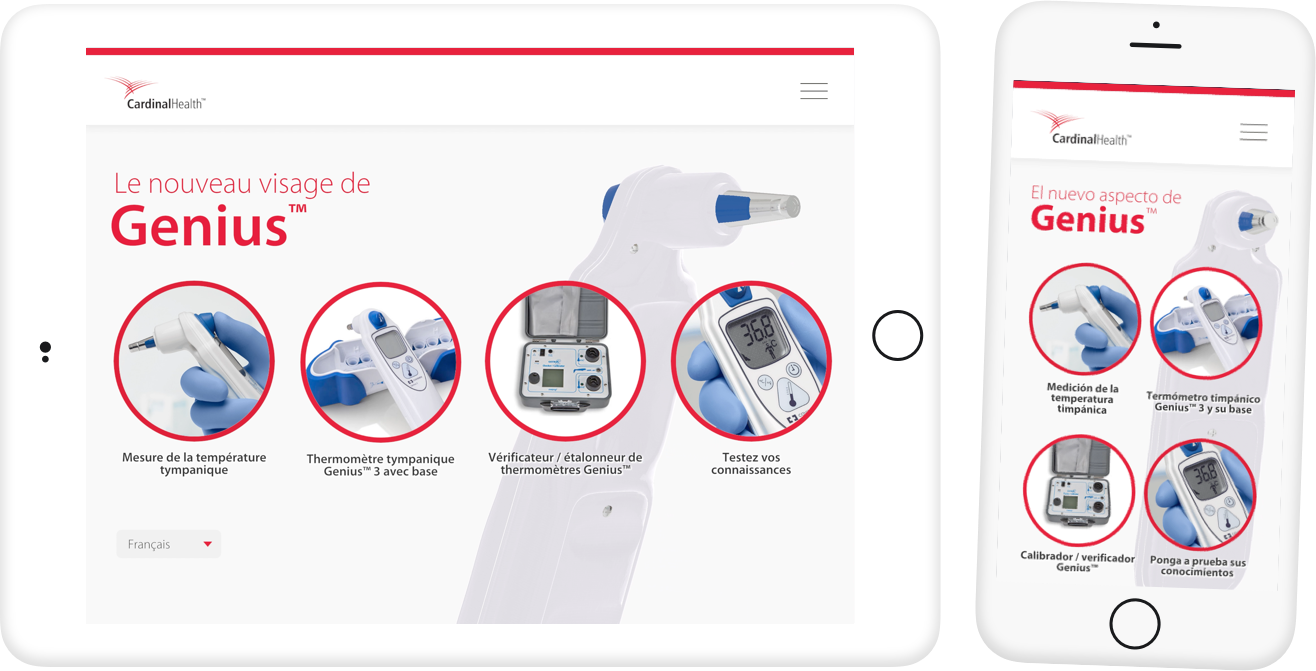
I designed and built the Genius app for Cardinal Health, an iOS and Android app providing a guide to their thermometer product. Its a multilingual application centered on 3d models, a series of videos and step-by-step guides.
The Genius app was created in Sketch, Blender and Unity
Left is Right is the creative business of me, Stuart Wallace, a designer and developer with over 20 years experience.
In that time I've worked with lots of people - media organizations such as the BBC, healthcare companies like Johnson & Johnson, startups, universities, live event organisers, book publishers, and many more.
In terms of software I usually work in Unity, javascript frameworks like React, React Native and Phaser, as well as Blender for 3d art and Sketch for 2d art.
I split my time between The Skiff, a coworking space in Brighton, UK and nearby Lewes.
Please get in touch if you'd like to discuss your next project.